Great big bodies
I think the thing that really irritates me about the Long Tail is just how basic the statistical techniques underlying it are. If you've got all that data, why on earth wouldn't you do something more interesting and more informative with it? It's really not hard. (In fact it's so easy that I can't help feeling the Long Tail image must have some other appeal - but more on that later.)
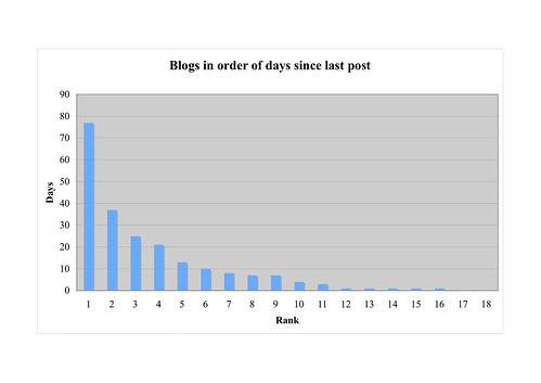
As you may have noticed, this weblog hasn't been updated for a while. In fact, when I compared it with the rest of my RSS feed I found it was a bit of an outlier:
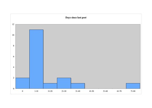
The Y axis is 'number of blogs': two updated today (zero days ago), 11 in the previous 10 days, 1 in the 10-day period before that, and so on until you get to the 71-80 column. Note that each column is a range of values, and that the columns are touching; technically this is a histogram rather than a bar chart.
You can do something similar with 'posts in last 100 days':
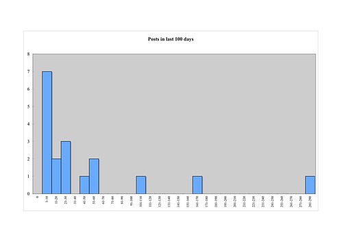
This shows that the really heavy posters are in the minority in this sample; twelve out of the eighteen have 30 or fewer posts in the last 100 days.
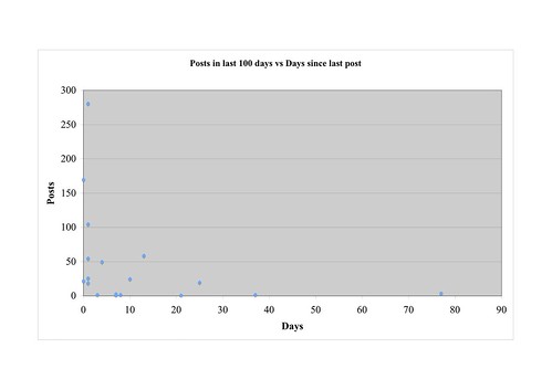
So it looks as if I'm reading a lot of reasonably regular but fairly light bloggers, and a few frequent fliers. If you put the two series together you can see the two groups reflected in the way the sample smears out along the X and Y axes without much in the middle:
My question is this. If you can produce readable and informative charts like this quickly and easily (and I assure you that you can - we're talking an hour from start to finish, and most of that went on counting the posts), what on earth would make you prefer this:
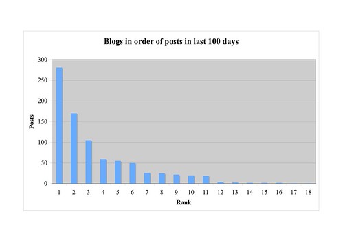
or this:
I can only think of two reasons. One is that it looks kind of like a power law distribution, and that's a cool idea. Except that it isn't a power law distribution, or any kind of distribution - it's a list ranked in descending order, and, er, that's it. The same criticism applies, obviously, to the classic 'power law' graphic ranking weblogs in descending order of inbound links.
DIGRESSION
You can compute a distribution of inbound links across weblogs using very much the techniques I've used here - so many weblogs with one link, so many with two and so forth. Oddly enough, what you end up with then is a curve which falls sharply then tapers off - there are far fewer weblogs with two links than with only one, but not so much of a difference between the '20 links' and '21 links' categories. However, even that isn't a power law distribution, for reasons explained here and here (reasons which, for the non-mathematician, can be summed up as 'a power law distribution means something specific, and this isn't it').
END DIGRESSION
The other reason - and, I suspect, the main reason - is that the Long Tail privileges ranking: the question it suggests isn't how many of which are doing what? but who's first?. A histogram might give more information, but it wouldn't tell me who's up there in the big head, or how far down the tail I am.
People want to be on top; failing that, they want to fantasise about being on top and identify with whoever's up there now. Not everyone, but a lot of people. The popularity of the Long Tail image has a lot in common with the popularity of celebrity gossip magazines.
As you may have noticed, this weblog hasn't been updated for a while. In fact, when I compared it with the rest of my RSS feed I found it was a bit of an outlier:
The Y axis is 'number of blogs': two updated today (zero days ago), 11 in the previous 10 days, 1 in the 10-day period before that, and so on until you get to the 71-80 column. Note that each column is a range of values, and that the columns are touching; technically this is a histogram rather than a bar chart.
You can do something similar with 'posts in last 100 days':
This shows that the really heavy posters are in the minority in this sample; twelve out of the eighteen have 30 or fewer posts in the last 100 days.
So it looks as if I'm reading a lot of reasonably regular but fairly light bloggers, and a few frequent fliers. If you put the two series together you can see the two groups reflected in the way the sample smears out along the X and Y axes without much in the middle:
My question is this. If you can produce readable and informative charts like this quickly and easily (and I assure you that you can - we're talking an hour from start to finish, and most of that went on counting the posts), what on earth would make you prefer this:
or this:
I can only think of two reasons. One is that it looks kind of like a power law distribution, and that's a cool idea. Except that it isn't a power law distribution, or any kind of distribution - it's a list ranked in descending order, and, er, that's it. The same criticism applies, obviously, to the classic 'power law' graphic ranking weblogs in descending order of inbound links.
DIGRESSION
You can compute a distribution of inbound links across weblogs using very much the techniques I've used here - so many weblogs with one link, so many with two and so forth. Oddly enough, what you end up with then is a curve which falls sharply then tapers off - there are far fewer weblogs with two links than with only one, but not so much of a difference between the '20 links' and '21 links' categories. However, even that isn't a power law distribution, for reasons explained here and here (reasons which, for the non-mathematician, can be summed up as 'a power law distribution means something specific, and this isn't it').
END DIGRESSION
The other reason - and, I suspect, the main reason - is that the Long Tail privileges ranking: the question it suggests isn't how many of which are doing what? but who's first?. A histogram might give more information, but it wouldn't tell me who's up there in the big head, or how far down the tail I am.
People want to be on top; failing that, they want to fantasise about being on top and identify with whoever's up there now. Not everyone, but a lot of people. The popularity of the Long Tail image has a lot in common with the popularity of celebrity gossip magazines.
Labels: cheery thoughts, flummery, web 2.0
posted by Phil at
1:20 pm
|
4 comments
![]()
